The return of the tactile – why physical painting matters again
Today, art is mostly discovered on a screen – yet its true quality reveals itself in space, in light and in the way the eye touches a surface. This tension is creating a new attentiveness to the tactile in art: to materiality, surface and layering in contemporary painting.
1. The Return of the Tactile in Art
Recent years have been shaped by enormous digital acceleration: artworks circulate in feeds, newsletters and online viewing rooms, often at the size of a palm. This shift in perception has had a paradoxical effect. The more art is conveyed through images, the more clearly we notice the loss of what cannot be translated into pixels: density, resistance, materiality. The return of the tactile is therefore less a fashionable trend than a countermovement to permanent visual availability.
Tactile art responds to a collective experience of distance. At a time when our gaze glides across glass – smartphone, tablet, monitor – there is a need for works that assert presence: painting that does not just show but physically stands in the room, bearing traces of gestures, tools and time. The tactile becomes a corrective to digital overstimulation and a medium in which closeness, depth and duration can be negotiated anew.
2. What “Tactile” Means in the Context of Art
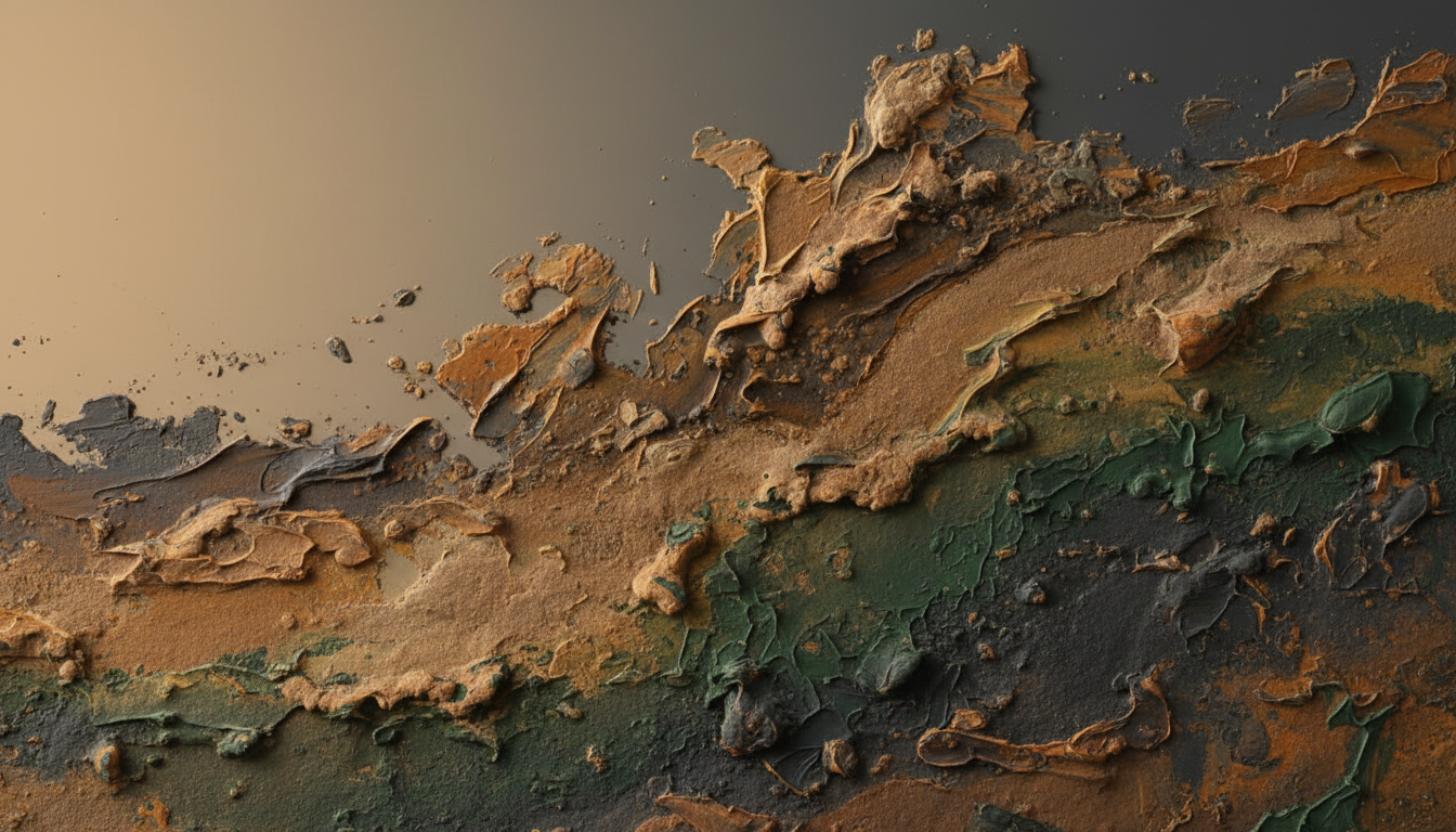
In the context of art, the tactile describes not only the potential of touching a work but, above all, how surface, material and structure become visually tangible. Materiality here means the concrete presence of paint as substance: pigment that forms a skin with its binder, layers that build up on top of one another, particles worked into the painted surface. The canvas is no longer merely the support of an image but a field in which gravity, drying processes and friction leave their traces.
In contemporary painting, paint is increasingly thought of as material, not just as a means of representation. Impasto creates relief, transparent glazes open up depth, matte and glossy passages respond differently to light. Tactile quality emerges where these levels are used deliberately: where a painted surface does not stay smooth and neutral but creates resistance, marks transitions and forces the eye to wander more slowly across the picture.
How do you recognize tactile quality?
– noticeable relief in certain areas
– an interplay of matte and glossy surfaces
– visible traces of tools and gestures
– layering that creates depth rather than mere coverage
– materials that refract or absorb light in nuanced ways
3. Where Digital Representation Reaches Its Limits
Digital reproductions can approximate color, convey composition and provide context. But when it comes to the tactile, they reach clear limits. A screen levels out differences: it turns every surface into a smooth, backlit plane. The finest ridges, minimal inclusions, the subtle roughness of paint mixed with sand – all of this disappears in the uniformity of the display. The difference between a deep, glazed blue and a dense, opaque blue becomes a question of tonal values, not of substance.
Then there is the difference between seeing and experiencing. On a screen, a work is usually seen head-on, from a fixed perspective. In a room, perception changes with every step: light moves, reflections appear, shadows deepen the structure.
Digital representation is reduced to the pictorial; physical perception, by contrast, includes physicality, scale, density and the specific effect a work has in a space. For collectors, this means that a purely digital judgment remains provisional whenever materiality and texture are concerned.
4. How Tactile Works Act in a Space
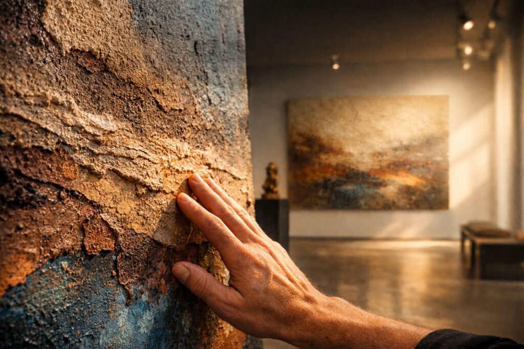
Tactile painting only unfolds its full power in a spatial situation. Light plays a decisive role. Raking daylight lets raised areas cast shadows, artificial light accentuates certain passages while others recede into a calmer depth. A relief-like surface responds sensitively to the smallest changes in lighting; the work looks different in the morning than in the evening, different in diffuse light than under a directed spotlight. This dynamic is part of its presence and cannot be captured in a static JPEG.
Perspective also plays a central role. A work with a pronounced structure changes as you walk past it: edges emerge, transitions become visible, embedded particles begin to sparkle or suddenly turn dull. Tactile painting therefore has a stronger presence in a room than works that read as flat. It asserts volume without becoming sculpture and engages the viewer’s body more intensely. For placement in homes and collection spaces, this means such works can set axes, guide sightlines and shape atmospheres that go beyond the purely pictorial.
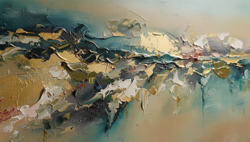
In raking light, relief, grain and depth of color become fully visible.
5. An Artistic Position: Sadik Uslu
One position that exemplifies the importance of the tactile is the work of Sadik Uslu. His paintings move between landscape and abstraction, between layers of earth and fields of color. They often look like excerpts of geological formations: sediments laid down on top of one another, concentrations in which pigment, earth and sand fuse into a relief-like surface. The picture plane becomes a kind of terrain that lets the eye wander and feel its way, rather than fixing it head-on.
Uslu works with layering as his central principle. Thin, transparent layers meet compact, impasto passages; fine cracks open microscopic depths, and inclusions of mineral materials give the painting an almost geological character. The boundary between picture and relief is deliberately kept blurred. The overall effect is a double reading: from a distance, the works appear as atmospheric color spaces; up close, they reveal a dense, physical structure. Here materiality becomes the carrier of meaning – not as a decorative effect, but as a precisely placed condensation of time, process and the experience of landscape.
In Favori Art’s curatorial practice, positions like this are deliberately highlighted. Sadik Uslu’s works can be suggested digitally, but never fully captured. Only in a direct encounter – at the scale of your own body, in the interplay of light and space – does their tactile quality reveal itself. We see ourselves as mediators here: we spark curiosity through carefully selected reproductions, while insisting on the importance of experiencing a work physically before making a collecting decision.
6. Why the Tactile Matters to Collectors
For collectors, a focus on the tactile is more than an aesthetic preference. It touches on questions of permanence, attachment and presence in one’s own surroundings. Tactile painting often reveals greater depth with repeated viewing. What first appears as an abstract structure becomes more differentiated over time: individual traces stand out, the relationships between layers become legible, and the eye begins to follow movements and decisions in the painting process. The work is not exhausted by the first impression; it remains open to discovery precisely because its materiality is complex.
Another aspect is the connection to the space. Tactile works respond sensitively to architectural situations: they can concentrate calm, minimal rooms by establishing a physical counter-presence, or act as focused, material anchors in more heavily furnished surroundings. For collectors, this means that choosing a work is always also a decision about the atmosphere of a room. This is where Favori Art acts as an advisory partner: we support not only the choice of an artistic position but also its precise placement, so that the work can unfold its full presence.
Questions to ask yourself as a collector:
– How does the work change when I change my position?
– Which structures only become visible in side light?
– Does the surface remain interesting after repeated viewing?
– How does its materiality relate to the materials of my space (stone, wood, glass)?
– What role does the tactile play in my collection as a whole?
7. Materiality as Quality, Not as Effect
In a present overflowing with images, there is a risk of misunderstanding materiality as a mere effect: a spectacular thickness of paint, a quickly consumable texture. A curatorially reflective view of the tactile starts elsewhere. Materiality becomes quality when it is grounded in content – when surface, structure and layering have an inner necessity and correspond to the thematic field of the work, such as landscape, memory, body or geology, as in the work of Sadik Uslu.
Favori Art positions itself as a curatorial authority that makes such differences visible. We show contemporary painting in which materiality is used not decoratively but analytically and poetically. Digital visibility remains a necessary first step – it opens up access, allows comparison and offers orientation. But the decisive moment deliberately shifts into physical space: into the direct encounter between work and viewer, where texture, depth and layering unfold their true effect.
The materiality of a work often reveals itself only in direct experience. We are happy to show you selected works – for instance by artists such as Sadik Uslu – and to advise you on their effect in your space and on the role of the tactile within your collection.
This quiet interplay of digital information and physical experience is the real strength of a collector-oriented platform like Favori Art.