
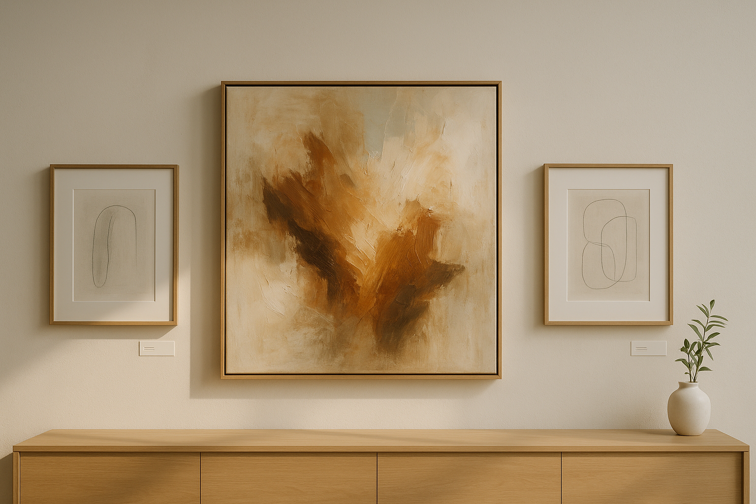
A piece about presence, stance and the kind of look that stays.
You are not choosing between “better” and “worse,” but between two roles in a room: the original as an anchor, the edition as a beat. Imagine the first morning light moving sideways across the surface – that is where the right choice begins. We think of spaces first in points of rest, then in rhythm.
What You Really Buy with an Original
An original carries the trace of its making: overpainting, corrections, depth of pigment. It is not an event for the moment but a resting tone that gives a wall direction. The longer you live with it, the more meanings layer up – not only in the picture, but in your everyday life. An original grounds a room: it turns a wall into a stance.
Example: a large work above a sideboard that gathers the gaze while the morning light reveals the brushstrokes.
When Editions Are the Stronger Choice
An art edition – limited, signed, numbered – is not a poster but a work in its own right with clear provenance. Good fine art prints on archival papers (pigment prints) read differently from canvas: finer, more rhythmic, surprisingly versatile. Editions work beautifully in movement: stairs, corridors, work areas – anywhere a serial rhythm structures the space.
Example: three related pictures along a staircase provide orientation step by step – each time you pass, you notice a new nuance.
Think in Spaces, Not Square Footage
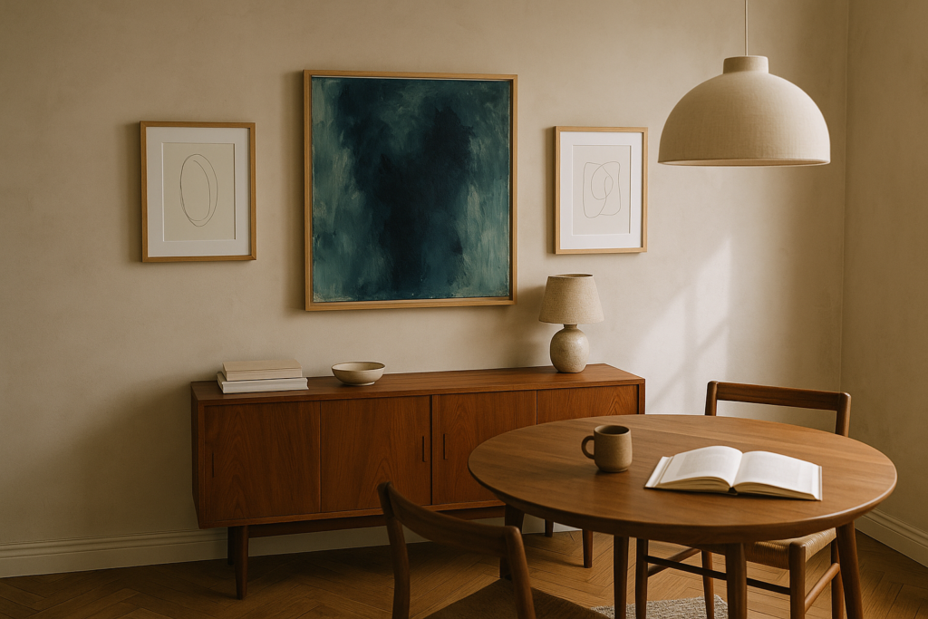
The focus wall
A medium to large original as the lead work makes a zone “yours.”
Two calm, limited pictures beside it are allowed to breathe – not as decoration but as a counterweight. The result is clarity, not volume.
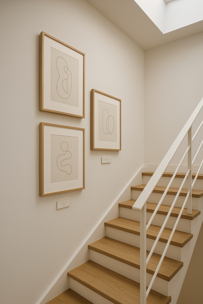
The movement zone
Stairs and corridors love rhythm.
Three matching editions – framed and hung the same way – set the beat without dominating.
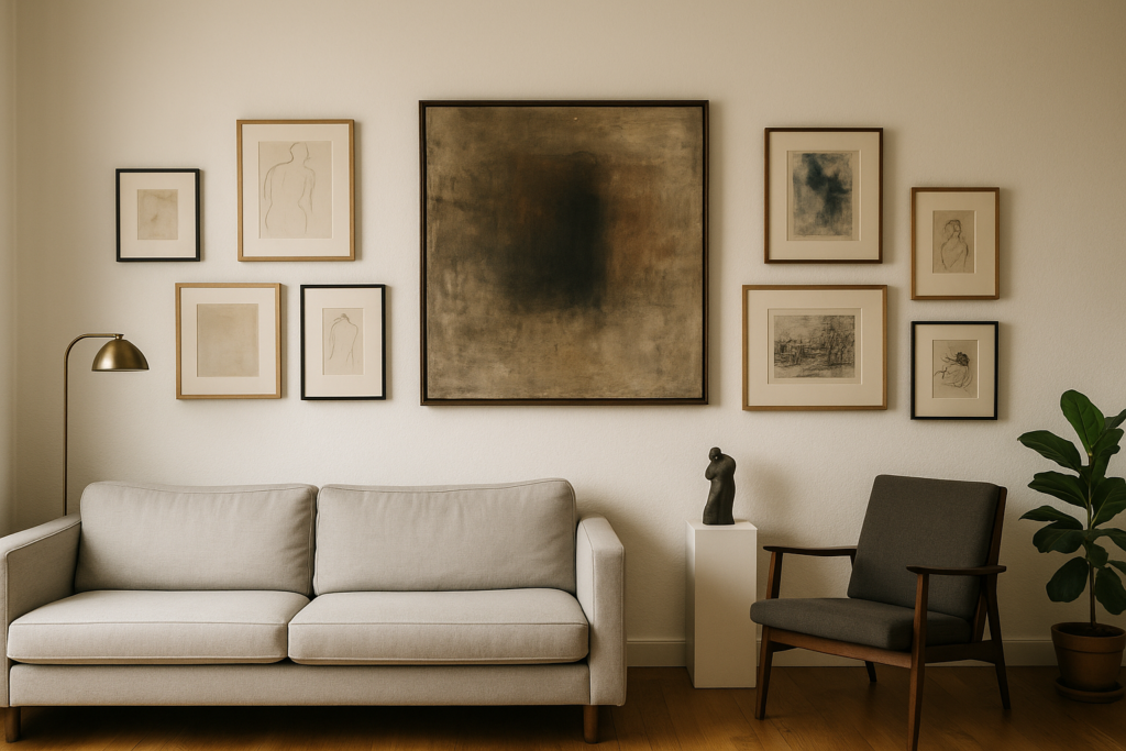
The salon mix
A wall as a story: one original as a point of calm, surrounded by several smaller editions, some portrait, some landscape. The axes align, the spacing is consistent – and the wall no longer speaks in exclamation marks, but in sentences.
Example: a living or dining area with an original at the center, flanked by two quiet graphic works – conversations naturally find the right tone.
Budget Is Not a Style, but a Strategy
Starting with a collector-quality limited edition is not a “waiting room” but a chapter. You sharpen your eye, learn how a motif holds up in everyday life and find your key in the room. Later, an original can join – as a fixed point. Many strong collections grow exactly this way: editions as fine connections, originals as load-bearing pillars.
Less important than the edition size alone is the combination of technique, paper, pigment, print studio, signature, certificate and context. Quality can be felt – and it lasts.
A Curatorial Combination: Original + Edition
Contrasts bring hangings to life: stillness next to energy, canvas next to paper, texture next to line. An expressive original gains when a reduced edition next to it clears the air. Two sheets from the same series can hold a dialogue; a one-of-a-kind work nearby places the comma in the right spot. This creates a stance – not hype.
Three Quiet Corrections to Common Myths
-
Edition ≠ poster. High-quality limited art editions with a certificate are works in their own right.
-
An original is not automatically “better.” In narrow zones, editions are often the more precise choice.
-
“The smaller the edition, the better” falls short. What matters is the interplay of technique, material and context – and your eye.
A Brief Look Inward
Which key does your room need today – anchor or beat? Originals give direction; editions give rhythm. If you like, we will think it through with you: calmly, precisely, curatorially.
What is the difference between an original and an art edition?
An original is a one-of-a-kind work with a visible trace of its making (depth of pigment, overpainting, individual decisions). An art edition is a limited, signed and numbered run of an authorized work – art in its own right, not a copy.
Remember: originals act as an anchor in a room; editions bring rhythm and can be thought of in series.
How do I recognize quality in art editions?
By signature & numbering (e.g. 3/20), a certificate, archival materials (pigment print on acid-free fine art paper, e.g. Hahnemühle), reputable provenance (studio/gallery) and a clearly communicated edition size.
Always read the edition size in context – technique, paper, print quality and artistic relevance count together.
How do I combine originals and editions in one room?
Focus wall: an original as the lead work, flanked by two calm editions (a clear hierarchy of spacing).
Movement zone: stairs and corridors love a serial beat – a triptych of editions, framed the same way.
Salon mix: an original as a point of calm, surrounded by several smaller editions (portrait/landscape), with consistent axes and spacing.
Are art editions just posters?
No. A high-quality limited art edition is a work in its own right with documented provenance. Open editions (unlimited runs) can be decorative but have a different collecting focus.
What role does my budget play – and how do I plan for the long term?
Collector-quality editions are a strong entry point, sharpen your eye and hold up in everyday life. Later, an original can join as a fixed point. Many collections come alive through exactly this balance.
Which framing and glazing make sense?
Originals: often floater frames (wood, archival).
Editions on paper: frames with a mat; in bright zones, anti-reflective glass for calm legibility.