A Guide to Corporate Art – Curation, Framing, Light & Installation
Before a single word is spoken, a space tells a story. Colors, materials, light – and above all art – translate values into atmosphere. In companies, art becomes a quiet counterpart: it creates orientation, shapes the mood and strengthens identity. This guide shows how art can work in business premises – clearly, practically and in a way you can apply.
The first impression: one minute that colors everything
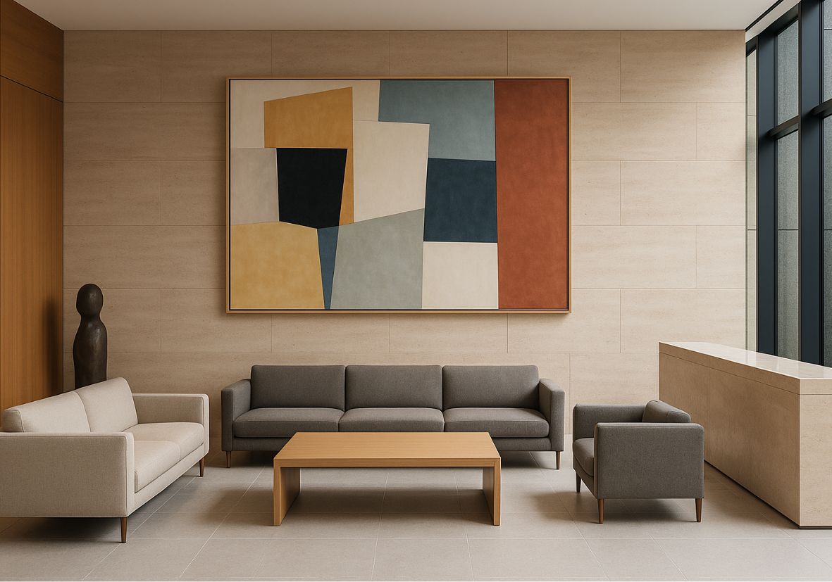
Foyers and lobbies are opening scenes. What convinces here is not volume but stance. A clear statement piece or a focused series gives direction, sets the tone and invites people to arrive. What matters is legibility from different sightlines: from the entrance, from the desk, from the seating area. Good placements stay in memory because they combine calm with tension – not size with overwhelm.
Meeting Rooms: Art That Listens
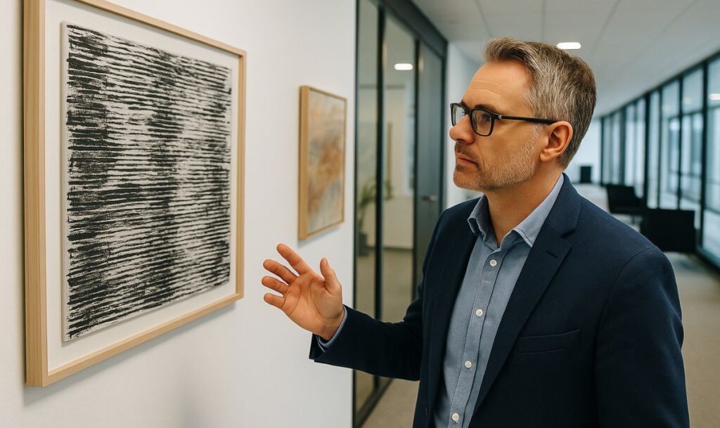
In meeting rooms, art changes the climate of conversation. Motifs with overly hard contrast or highly reflective surfaces create restlessness; quiet, structured works support concentration and trust. Drawing, reduced photography or serial hangings with subtle variations provide rhythm. Low-reflection glass (such as anti-reflective museum glass) increases presence without dominating. The color temperature of the light and the sightline to the screen are also part of the composition.
Corridors & Open Spaces: The Rhythm of Everyday Life
Corridors are not leftover space; they set the pace. Series in recurring formats, gentle variations on a color scale and robust supports create orientation, mark transitions and set the tempo. People who walk the same route every day “read” these sequences like music – refrains, crescendos, small pauses before meeting rooms. Functional aspects such as escape routes, cleaning and frequency of use are naturally part of the planning.
Hospitality Zones: Where People Want to Stay
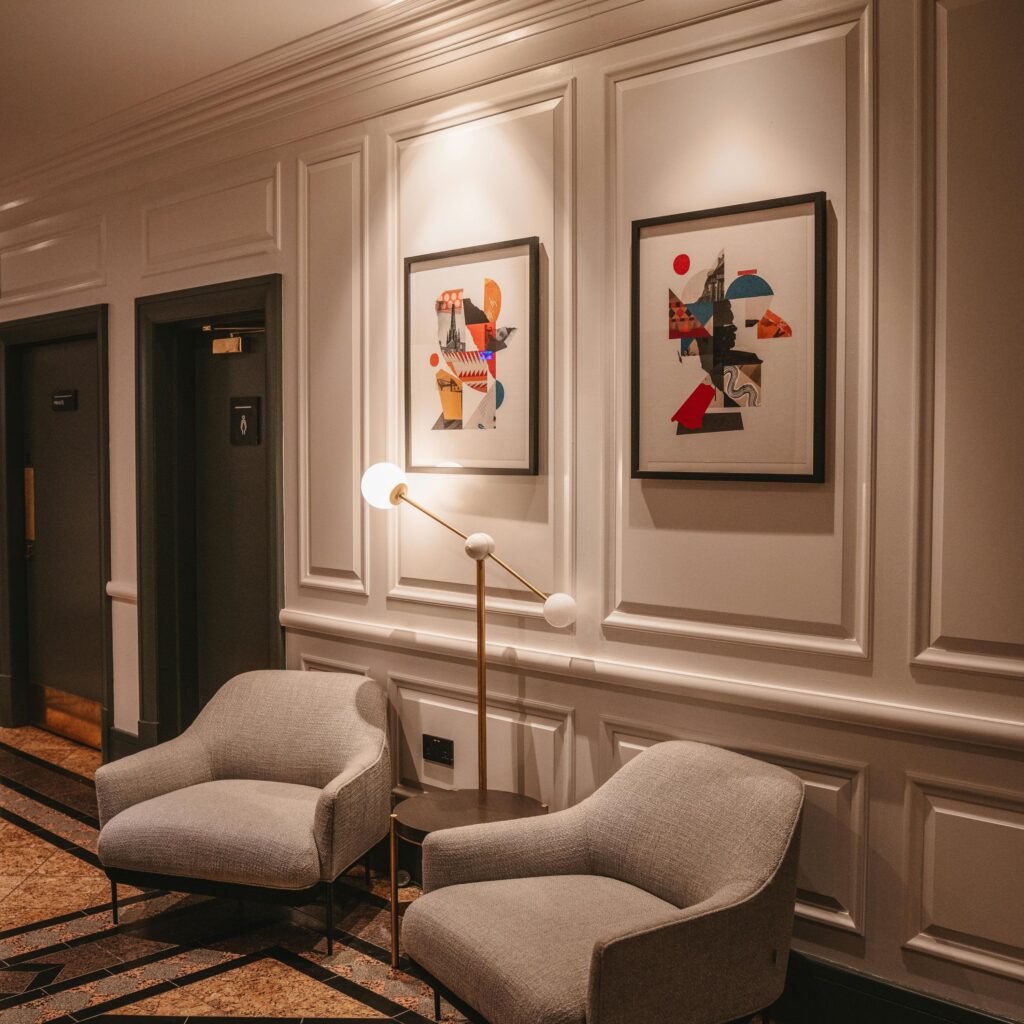
In lounges, cafés or guest areas, closeness counts. Tactile materials (linen, wooden frames), warmer lighting and carefully placed sculptures encourage conversation and longer stays.
Height is important: art “at eye level” at the table creates connection; works hung too high create distance. Figurative, poetic positions can anchor memories here without becoming merely pleasing.
Frames, Light, Proportion: The Silent Players
Even the strongest work loses out if its “supporting players” are wrong.
-
Proportion & breathing room: a large wall does not automatically mean a large format; what matters is the tension between placement and empty space.
-
Heights & lines: a clear bottom line (often around 145 cm / 57 in) calms the wall, and even spacing creates order.
-
Frames & glass: profile, mat and glass quality are part of the statement, not accessories.
-
Lighting dramaturgy: precise accents lift, overlighting dazzles. Daylight, reflections and cast shadows are considered deliberately.
Ways to Choose: Original, Edition, Commission
-
Originals often carry the strongest individual signature and long-term presence.
-
Editions allow serial concepts and high consistency – ideal for corridors or team zones.
-
Commissioned works can take up the location, its history or its materiality and fit perfectly as a result.
Whatever the route, transparently documented provenance, clear edition details and properly worded rights (e.g. reproductions in corporate communications) are the basis of any serious collecting practice.
Working with Artists & Institutions
A respectful dialogue starts with a precise brief: which spaces have which purpose? Which tone should be felt (e.g. precise – warm – progressive)? A list of works, condition reports, certificates and insurance values belong in the file. Labels (artist, title, year, technique) and a short story for each work increase accessibility – including for teams and guests who first experience art “from the gut.”
A Possible Process – Pragmatic and Transferable
-
Clarify goals: arrival, focus, dialogue, representation – name no more than three goals per zone.
-
Read the space: dimensions, sightlines, furniture, light sources, acoustics; derive a range of formats and a color temperature from them.
-
Curatorial thread: decide on a statement piece or a series; define repetitions and points of rest.
-
Material decisions: frame profile, mat, type of glass; consider surfaces and care requirements.
-
Hanging plan & labels: fix bottom lines, spacing and lines in writing; prepare short, consistent labels.
-
Documentation & care: lists of works and insurance values, simple care instructions, rights management, rotation schedule.
(These points are meant as orientation – they can be implemented with internal teams, external workshops, galleries or directly with artists.)
Common Pitfalls – and Elegant Alternatives
-
Hung too high: loses contact with the viewer → check the bottom line and take eye level seriously.
-
Patchwork instead of a line: many individual voices without connection → series, repetitions, clear axes.
-
Frames as an afterthought: technical reflections, the wrong profile → plan frame and glass as part of the statement.
-
Forgetting light: no spotlight or too much glare → targeted accents, actively test for reflections.
-
Trend instead of purpose: a fashionable color ≠ the sound of a brand → prioritize the room’s function and identity.
Sustainability & the Long Term
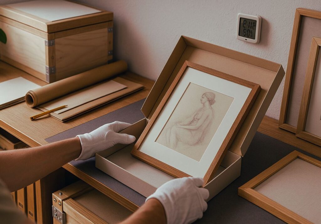
It makes sense to invest in durable materials, conservation-grade solutions and the shortest possible transport routes.
Documentation and care concepts keep collections auditable and future-proof. Rotation models (e.g. annual updates of individual works) keep spaces alive without making them feel restless.
Two Miniatures – as Pictures in Your Mind
A growing tech company chooses a single, calmly breathing statement piece for its lobby, flanked by restrained series in the corridors. The tone: clear, not cold.
A boutique law firm combines precise drawings in reception with a figurative “anchor” in the meeting room – a quiet human counterpoint to strict order.
Spaces That Speak – and Listen
Good corporate art is not decoration but an invitation to conversation. It makes values tangible, supports collaboration and anchors memory.
Thinking about spaces this way creates places that don’t just function – but stay with people. Looking for art for your business? Explore our art rental for companies or talk to us.